
Lightroom's Most Mysterious Tool
Alright, let’s dive into one of Lightroom’s most underrated, mysterious, yet powerful tool: Color Calibration. Depending on your version of Lightroom It’s the panel usually buried at the bottom of Lightroom’s Develop module that too many people gloss over. And I get it, maybe it seems too technical, or maybe the name just sounds intimidating. But if you’re serious about editing your images and want to give them a distinct, cohesive look, learning Calibration will absolutely change your workflow.
Remember a few years ago, the Teal and Orange look trend? If not, go Google it now. It is a very distinct colour pallet so you will see me use it as a example throughout this Blog. I’ll also use color and colour interchngably cause i’m Australian and Adobe is American.
What Is Calibration?
So, Color Calibration: what is it, and why should you care? In simple terms, it’s a tool that allows you to tweak the red, green, and blue primary colours in your image. When people rave about a camera brand’s “colour science,” they’re essentially talking about how that camera interprets and displays those three colours. But the thing is: not all “blue” or “red” are created equal. One manufacturer might lean towards warmer reds, while another brand’s blue might be more teal.
RGB is the primary colour model used in digital screens, cameras, and editing software. It's how colours are created by combining different intensities of Red, Green, and Blue light. Every colour you see on a screen is made by mixing these three colours in different ways.
Let’s talk about colour harmony for a second because it’s a big deal when it comes to making your images stand out. Calibration isn’t just about tweaking colours randomly, it’s about creating a balanced and cohesive look that works across the entire image. Think of it like fine-tuning the colour palette to bring everything into sync.
Complementary colours (like teal and orange, or red and green) are opposite each other on the colour wheel, and when used right, they create this natural contrast that’s super pleasing to the eye.
Calibration lets you push these colours in a way that your camera’s default colour science just can’t do.


Why Most People Avoid It
I get it, Calibration can seem a little daunting at first and hopefully the above section didnt scare you away. There’s a lot going on behind the scenes, and those sliders might not feel as intuitive as, say, tweaking exposure or contrast or even the colour grading section in Lightroom. But let me tell you from personal experience, once you start to understand this tool and how RGB values interact, you’ll wonder how you ever edited without it. It’s like unlocking a whole new level of control over your images. When I first started using Calibration, it took a lot of trial and error but eventually it completely changed the way I edit, but i’m not going to lie… it was frustrating learning it.
Breaking It Down: The Magic of Calibration
Calibration’s power lies in its global impact. While the Hue/Saturation/Luminance (HSL) sliders affect specific ranges of colours (like making just the yellows pop or cooling down the blues), Calibration changes the entire image. It shifts all the colours based on their red, green, and blue values (RGB). This means you’re not just adjusting individual colours, you’re reshaping the entire palette of your image.
Here’s a quick rundown of how it works:
Red Primary: Shift this slider to the right, and you’ll warm up your image, making reds more orange. Move it to the left, and you’ll head towards magenta.
(i’ll use this red section on show how the RGB values interact with the Calibration tool vs a Actual photo)


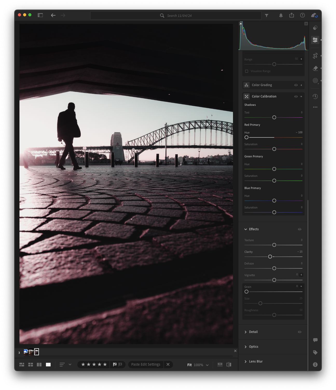
Green Primary: Push this to the right for more teal tones, or to the left to get a richer yellow-green.
Blue Primary: Move it left to bring in teal, or right for a purple tint.
The way I started to understand how the Calibration tool worked, I imported a RGB chart from Google images into Lightroom and manipulated the values. You can also screen shot the Chart I used at the beginning of the blog and use it in Lightroom just the same.
How Hue and Saturation Work Together
Now, here’s where things get interesting. These sliders don’t work in isolation; they work together to give you serious control over your image’s colour profile. Want a teal-and-orange look? You can adjust the Blue Primary Hue to the left to create teal and then push the Blue Primary Saturation to make it more intense. At the same time, you can tweak the Red Primary Hue towards orange and increase its saturation for a bold, contrasting effect.


Hue adjusts the shade of the colour (what exact tint you're dealing with).
Saturation adjusts the strength of that colour (how bold or muted it is).
Both of these sliders affect every pixel in the image globally, meaning any tweak you make impacts the overall look of your photo. Just like the colour grading section in Lightroom, this is a very powerful way to adjust colour in your image… so tread carefully!
Real-World Examples
Let’s talk about how Calibration can be used in a few practical ways.
Enhancing Landscapes
Got a photo with a mix of greens and yellows that just doesn’t feel cohesive? With Calibration, you can shift the green primary to bring all those tones together, creating a more harmonious look. It’s especially useful if you’re editing photos of nature or landscapes, where you want the greens to really pop in a consistent way. Sometimes shifting the trees and shrub colours away from harsh greens to a more orange tone, helps compliment the colours.

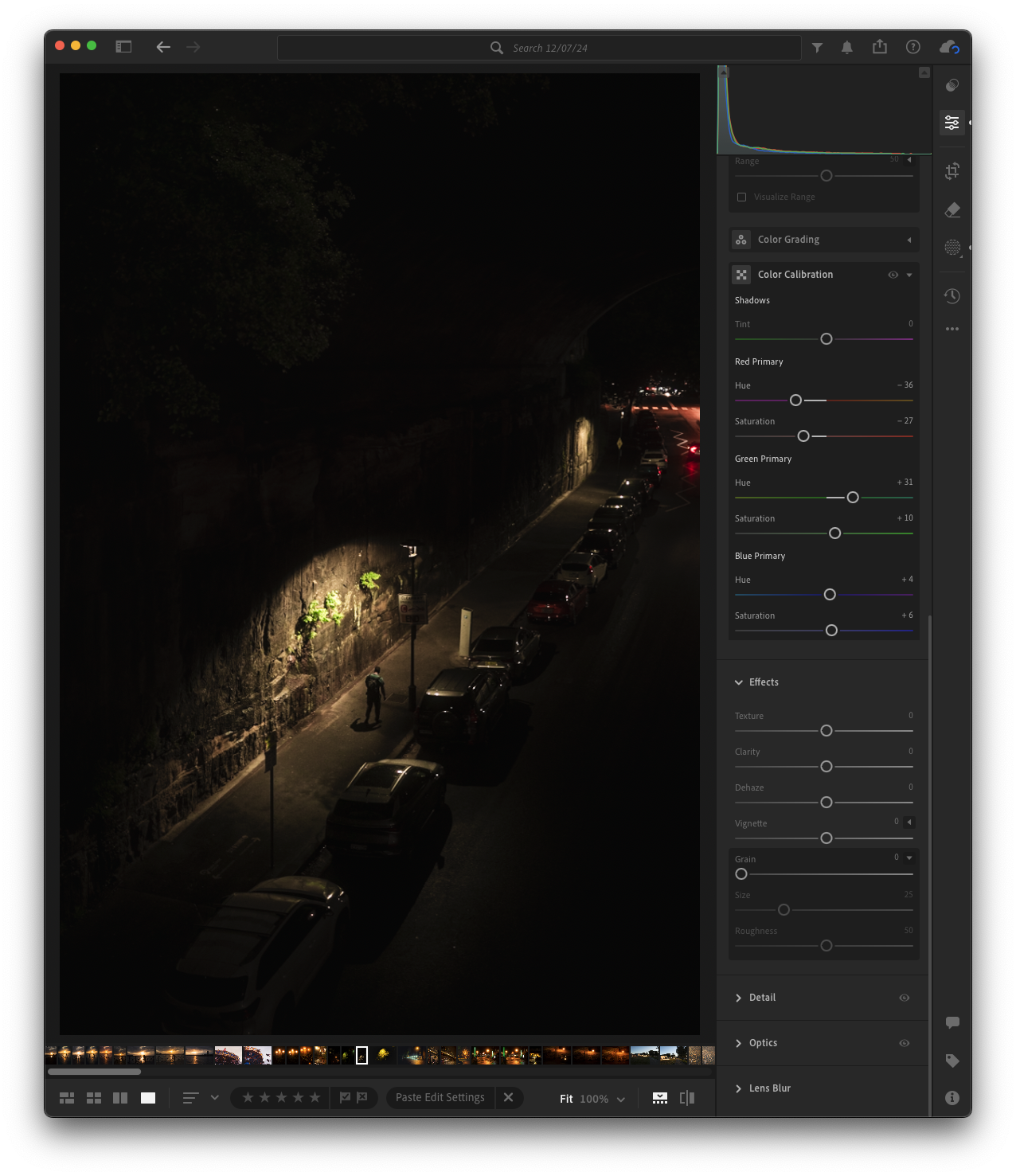
Correcting Colour Casts
Ever taken a night shot under weird, artificial light and ended up with a gross yellow or green cast? You could desaturate the offending colour in HSL, but you’ll probably lose some of the richness in the areas that are supposed to be yellow or orange. Instead, try using Calibration to shift the green and blue primaries, and you’ll keep the right colours while getting rid of the unwanted cast.

Creating a Signature Look
This is where Calibration really becomes your secret weapon. Personally, I like keeping colours as realistic as possible and my colour grading is only used in very specific situations when I want to enhance the mood of a image. In the Calibration tool by tweaking the blue and red primaries, I’ve found that I can make my images feel cohesive without distorting reality too much. This signature style is going to be personal to you, so experiment and see what you like squeezing out of your images.

Consistent Look Between Camera Brands
Expanding on the signature look of your images. I tend to use Calibration to help keep images looking similar if they were shot on different cameras. As a example, Fuji often has a warmer look with punchy greens and blues compared to Nikon or Sony. Where Sony is on the opposite side of the spectrum and has a more cooler muted look. Calibration lets me keep things consistent if I pair images together that were shot on different cameras.
Finally,
Look, I know Calibration can feel like the deep end of the pool when it comes to Lightroom editing. But once you start to get the hang of it, you’ll see the creative possibilities it opens up. It lets you move beyond your camera’s built-in colour science and gives you the control to shape your colours. If you are like me, It’s that tool you didn’t know you needed, but once you learn it, you’ll never go back.